HOME.jpg

Building a foundation for growth for this Washington state general contractor

A New Mark for Tillit Design + Build

Tillit is a general contractor serving homeowners throughout the Pacific Northwest. As a design + build company they offer clients a variety of comprehensive design and construction services with their primary focus being residential remodels, additions, and renovations. Their previous logo was a wordmark with no accompanying symbol or icon. Think Google, CocaCola, and Ford. As a young company entering a highly competitive industry, they recognize that truth and transparency are foundational to building a positive reputation, securing sustained growth over the long-term, and creating an enduring market presence.

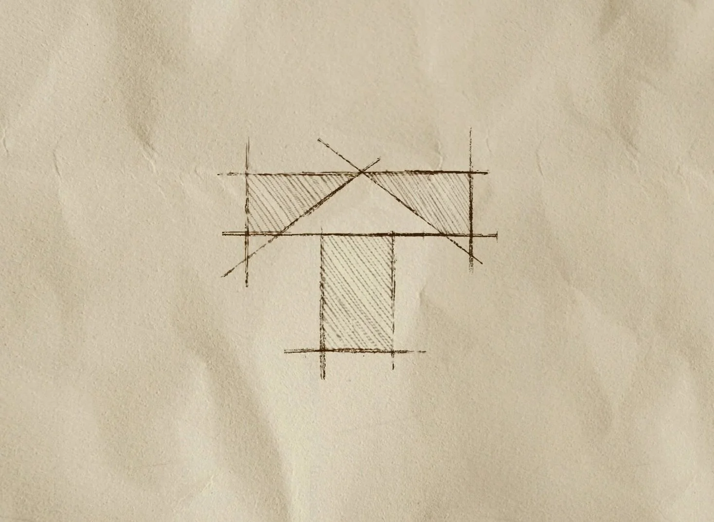
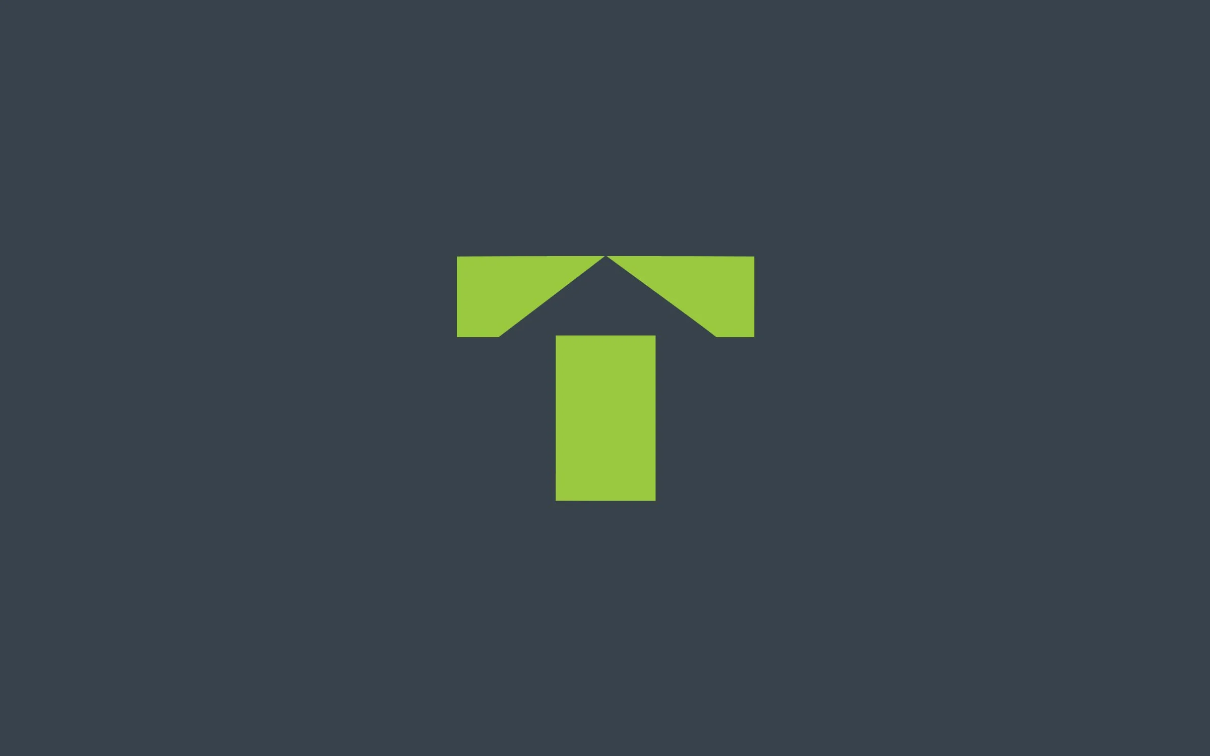
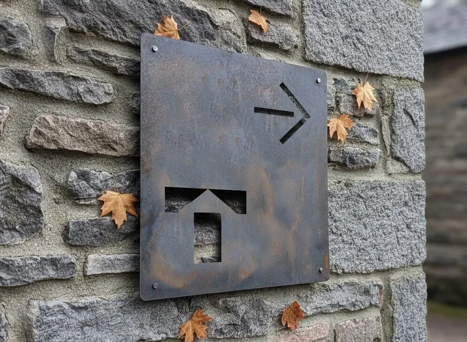
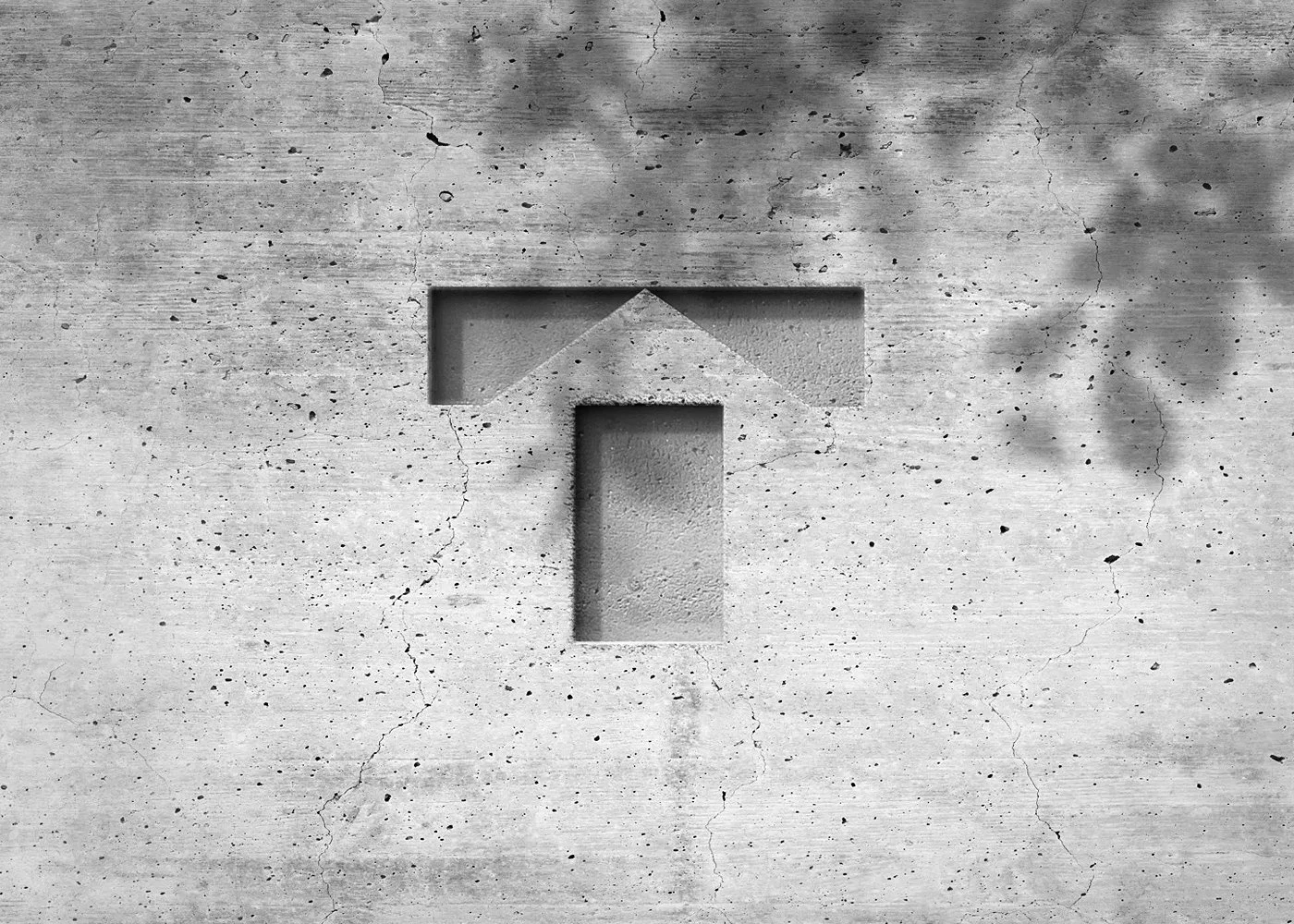
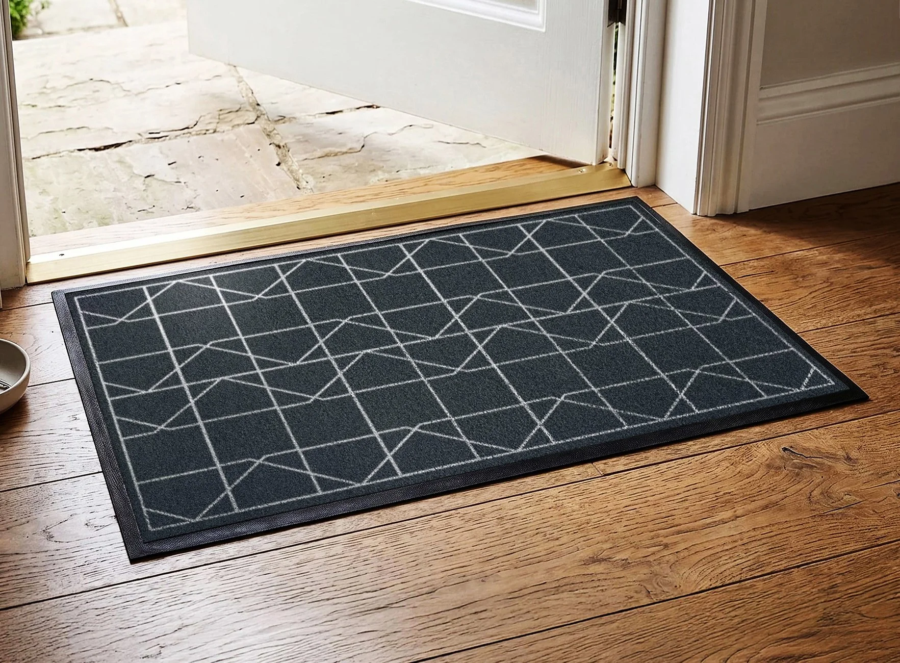
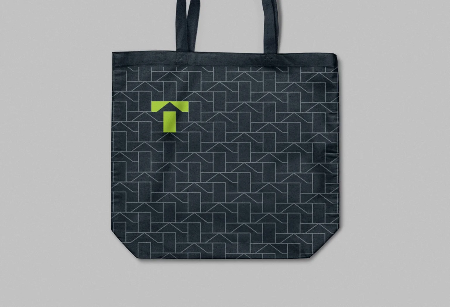
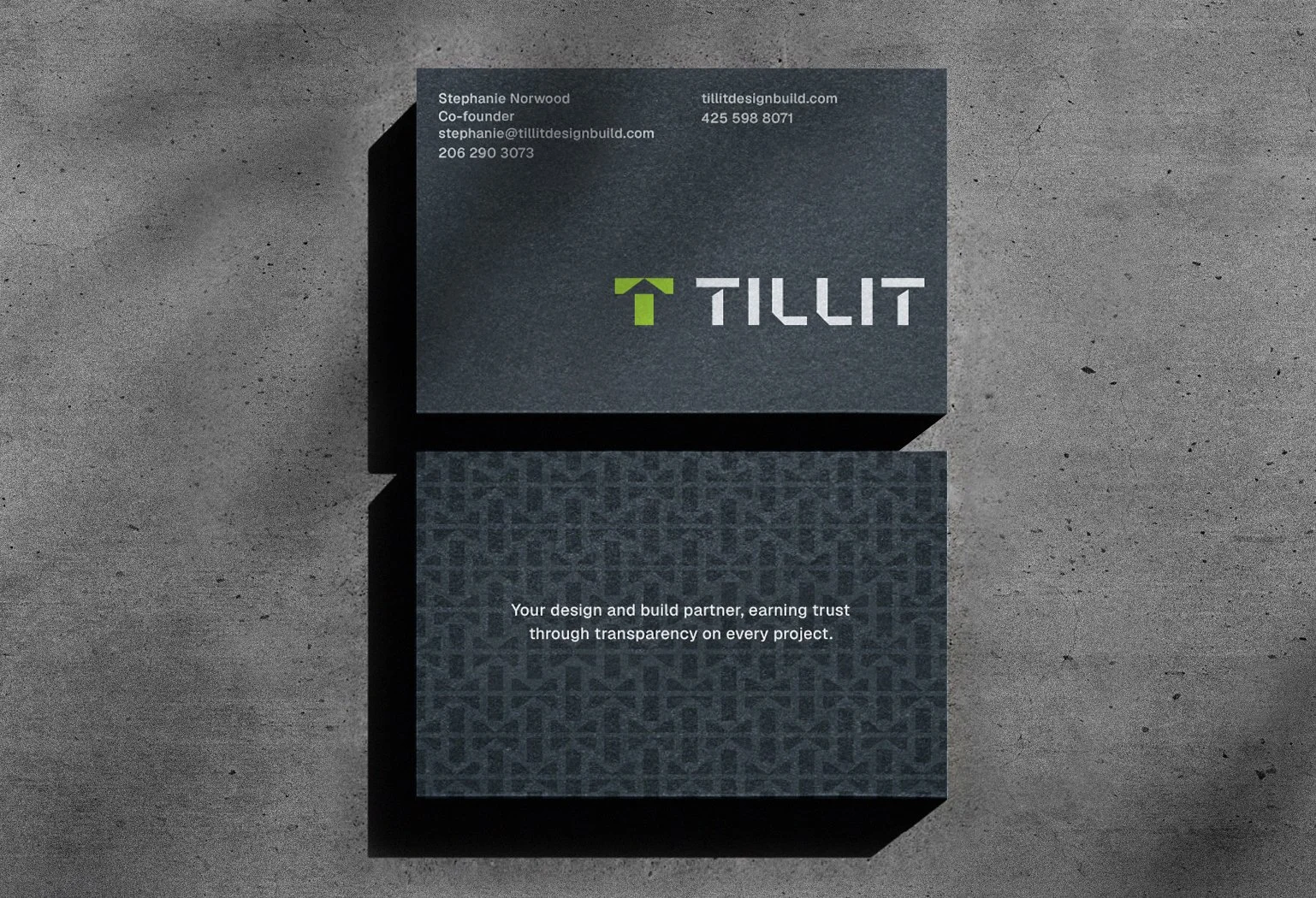
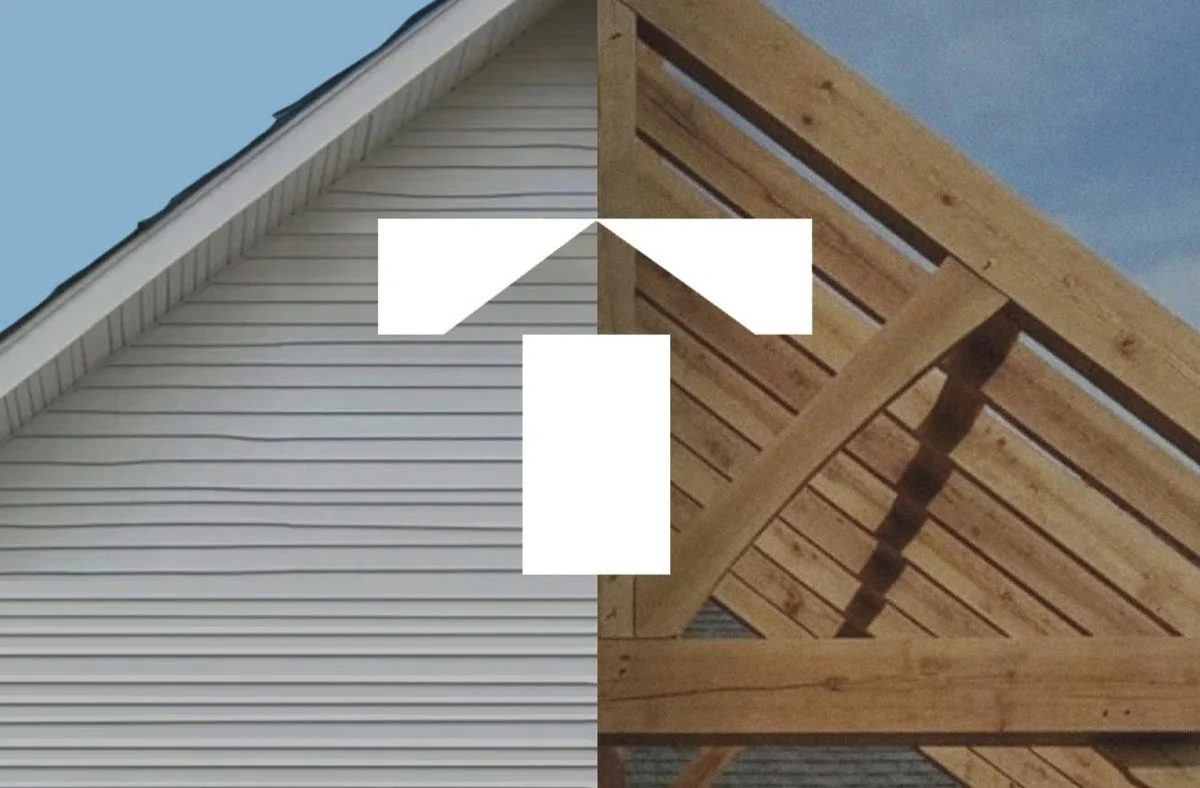
For Tillit, adopting a lettermark was a strategic move to simplify their visual communications, improve design cohesion, and build unmistakable brand recognition. Inspired by a home’s facade, the new geometric “T,” with its angular lines and simple shapes, has become an aesthetic anchor for every other element in their visual language, including the name display. Timeless and tasteful, ​i​t projects strength, reliability, and trust. Because of its form, the mark scales seamlessly and is extremely versatile, maintaining its integrity across different materials—whether cut out of metal, carved in wood, molded in concrete, or embroidered on fabric. Custom patterns, derived from the mark, have also become a useful tool in their identity toolbox.

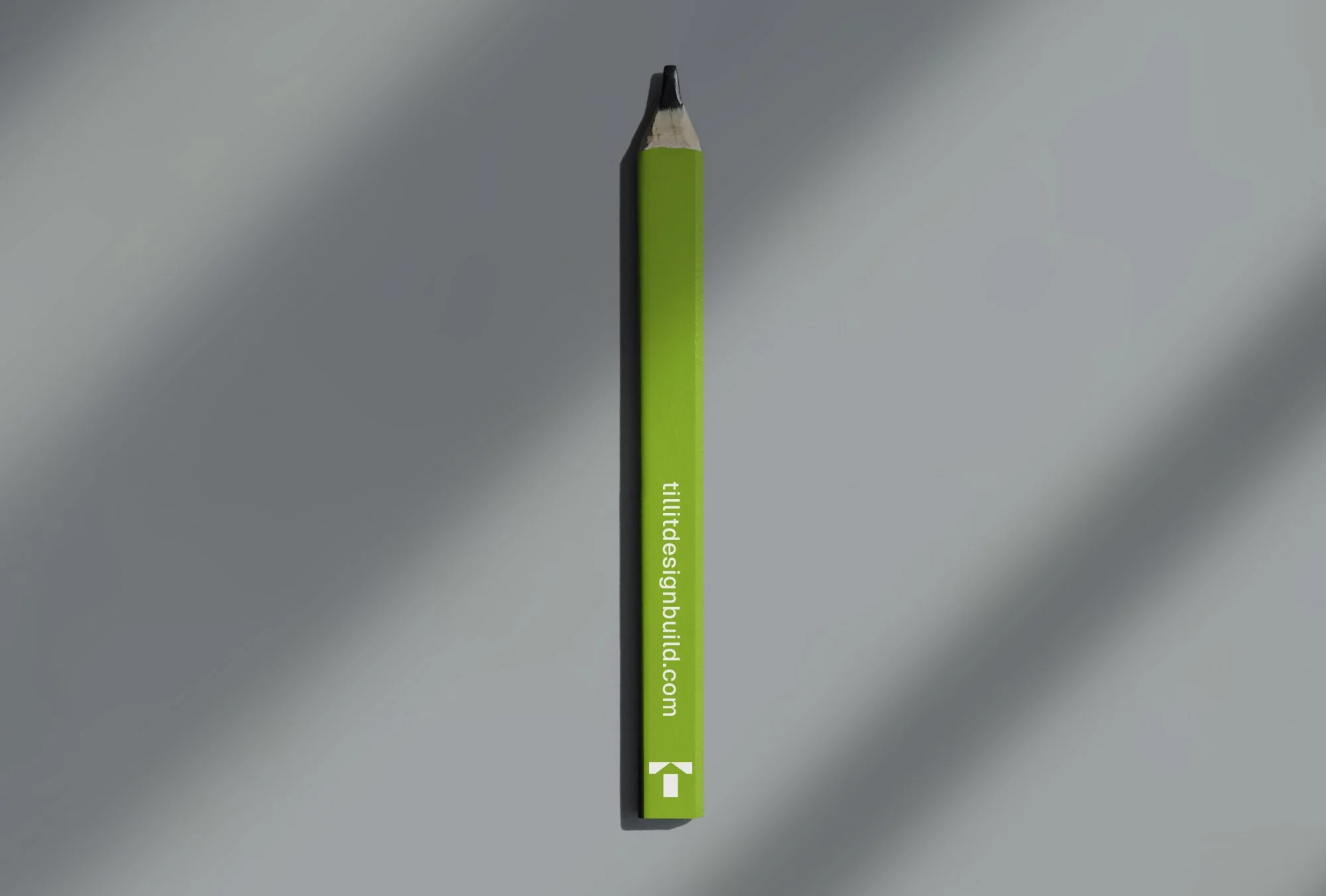
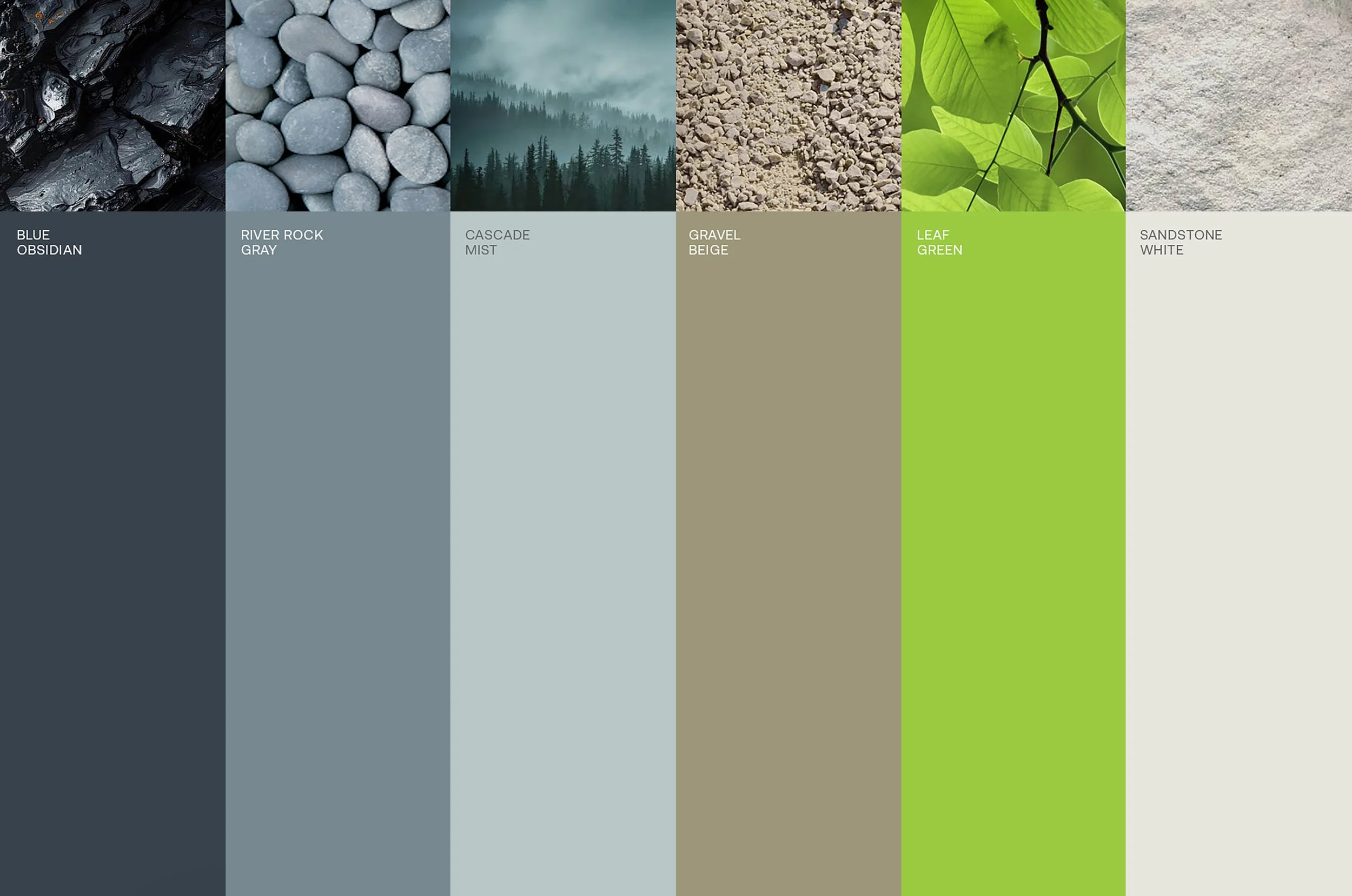
Inspired by nature and the northwest, their brand palette is a sophisticated combination of blue and gray tones with neutral colors. A touch of vibrancy is added through the use of a bright, energetic green, signaling Tillit’s commitment to sustainable, eco-friendly building practices. Together, these elements give Tillit a memorable identity that is quick to recognize and easy to recall. They are now poised to present themselves with a clear and confident voice within the design + build industry.