A Guide Examining the Evaluative Methodology Known as Process Tracing
A Guide for Evaluators
Evaluators work in the social innovation space where inspiration is limitless, but resources aren’t. For those seeking the support needed to test or scale their efforts, it’s important to show how their contributions effect positive change. However, similar to a detective searching for clues, this evidence can be hard to come by, especially when it lives within complex, dynamic contexts. Process tracing is an evaluative methodology that helps social innovators understand how large-scale changes—be it policy changes, systems changes, or cultural shifts—actually happen. The story of how these changes happen includes both the steps taken to achieve the change (e.g., a program) along with other contributing events, forces, or factors in the larger context. By focusing on stories of change, the process tracing method provides a structure for understanding contributions that are inclusive, rigorous, and open to emergence.
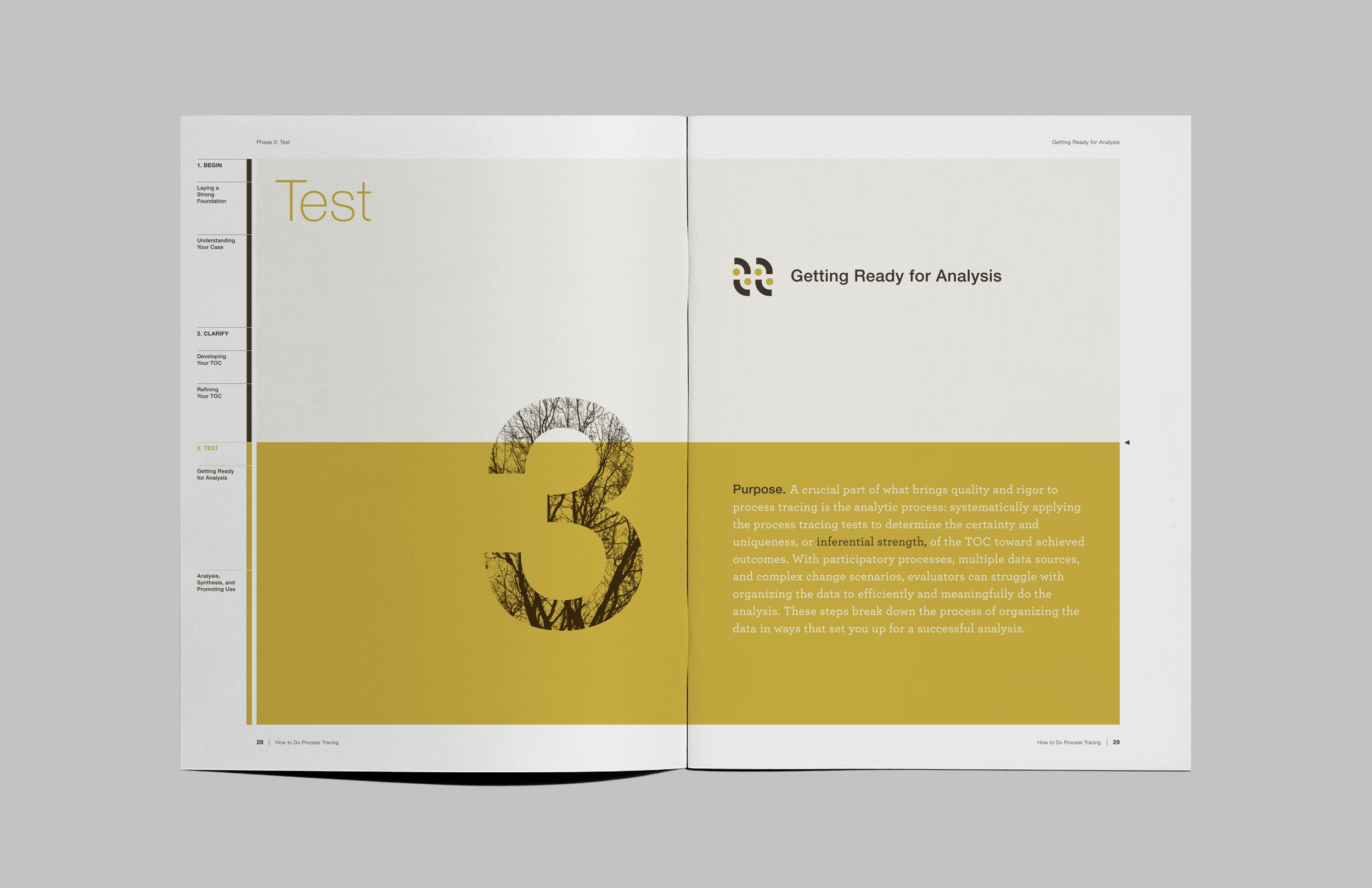
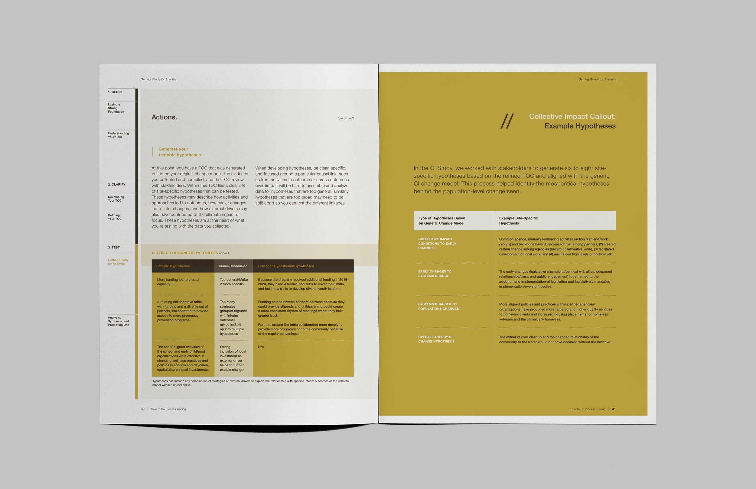
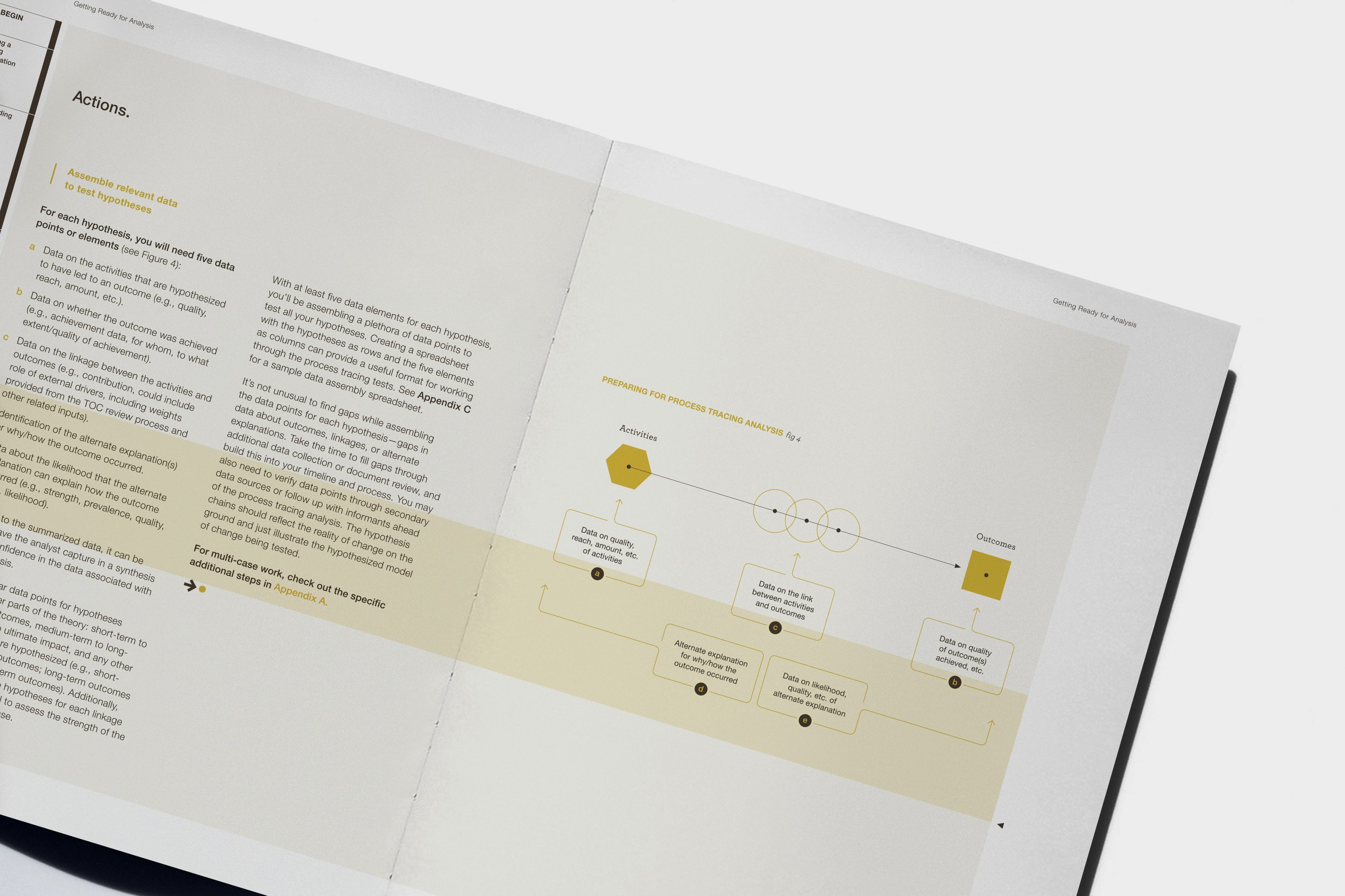
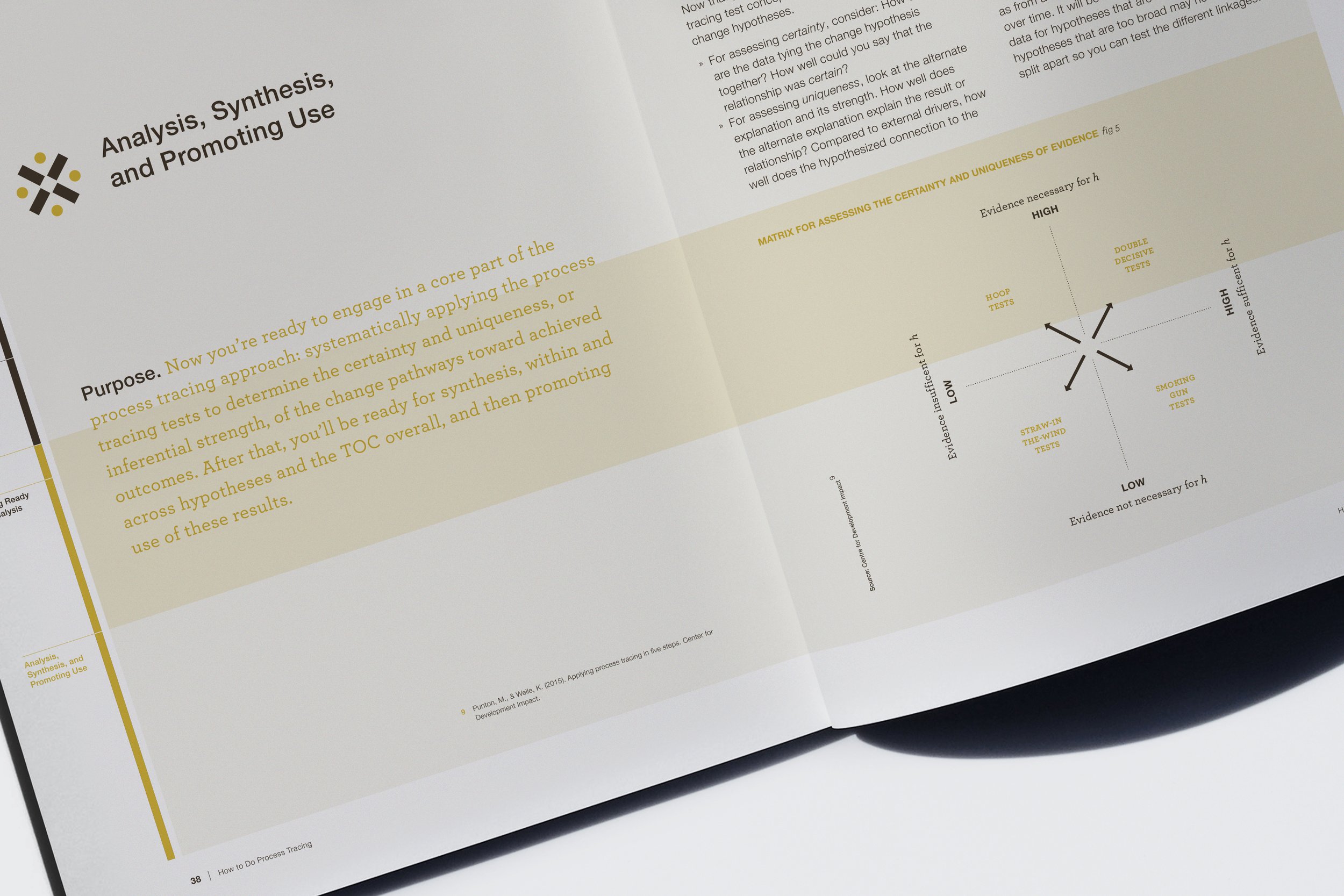
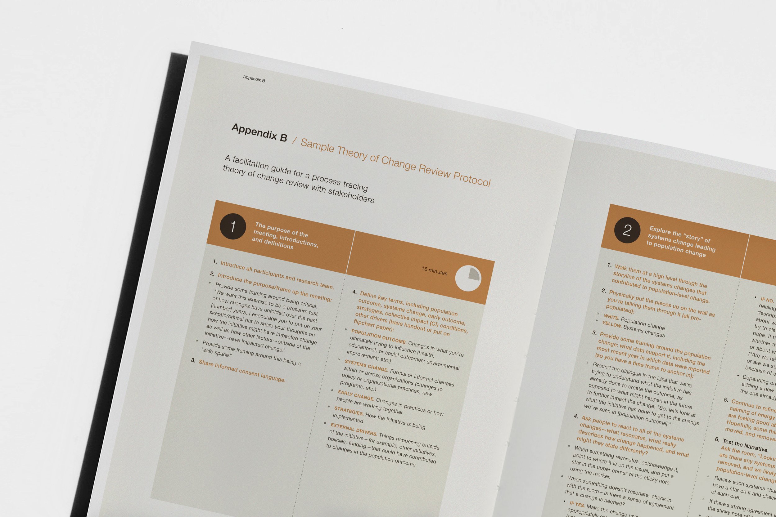
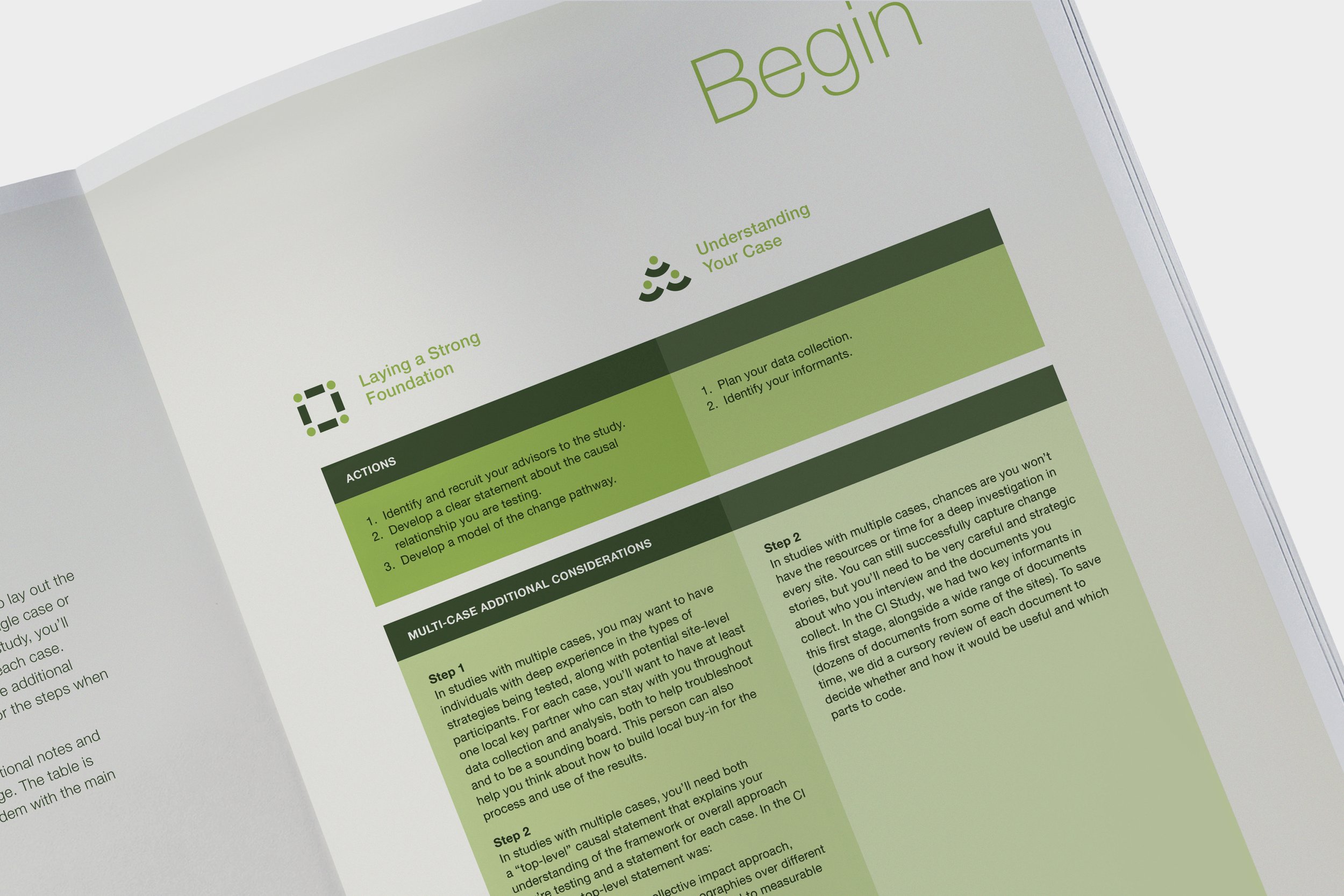
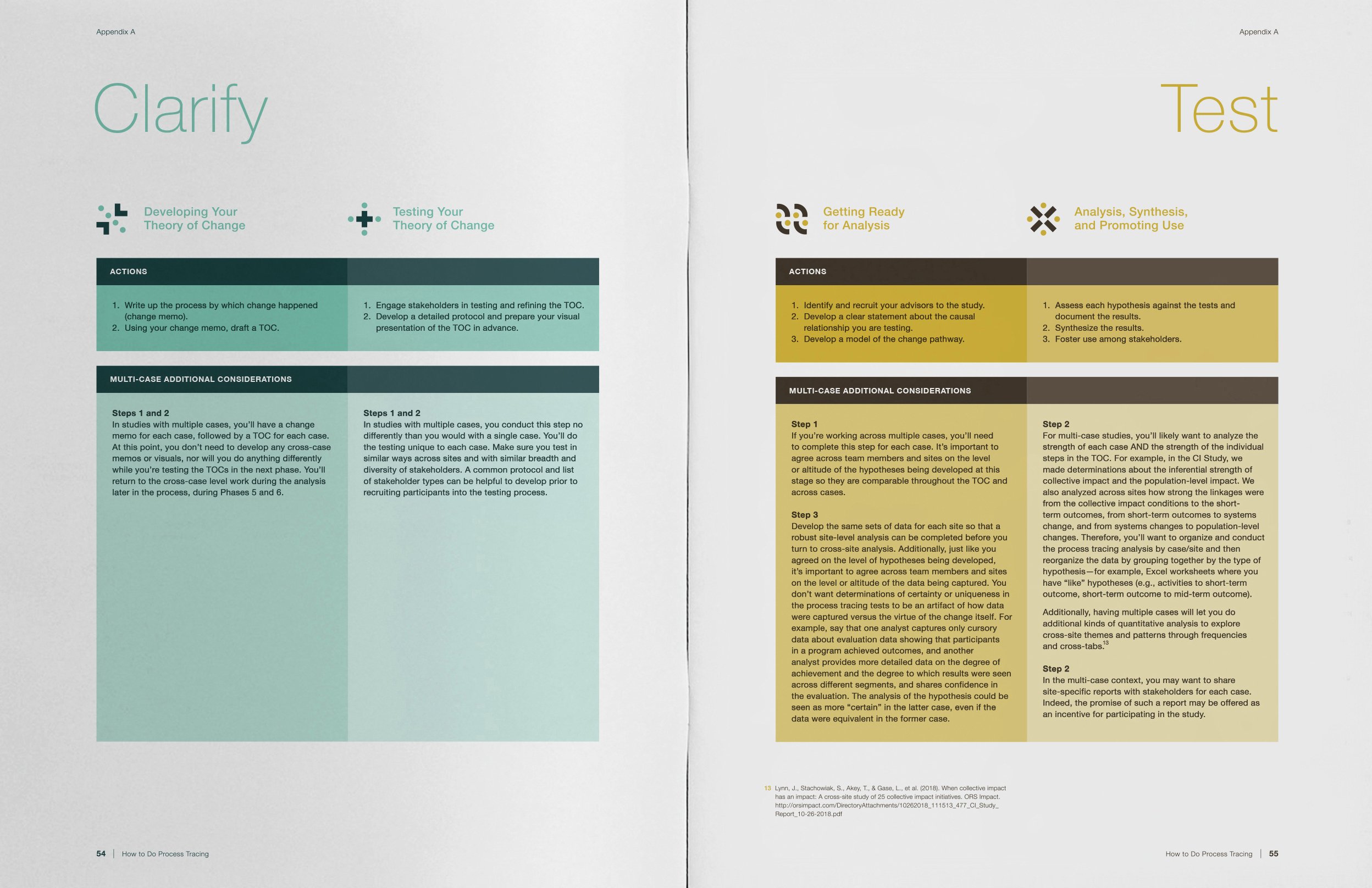
Collaboratively developed by Jewlya Lynn, Sarah Stachowiak, and Jennifer Beyers, a series of six practical steps (shown above) are organized into three phases (Begin, Clarify, and Test) and explain how to use the process tracing method in the context of complex systems-change efforts. By using participatory approaches, providing illustrative examples, and lifting up key considerations and potential pitfalls, they demonstrate how nonprofits, funders, and other social change agents can achieve greater impact by understanding how, under what conditions, and in what contexts, positive changes have been, and can be, achieved.
The design process began by recognizing that the digital experience would be greatly enhanced if readers were given the ability to quickly and easily move about the document, from one phase to the next, and back again if needed. To accommodate this functionality, a vertical menu featuring clickable titles was positioned on the left side of each spread (see below) which significantly improved navigation. Color distinguishes each phase, and icons are used to identify and reinforce the six steps, shown earlier. The tables and diagrams were designed to be simple and straightforward, and the layout, which is very much content-driven, uses a two-column format and generous amounts of white space to deliver a clear, modest, and elegant presentation.