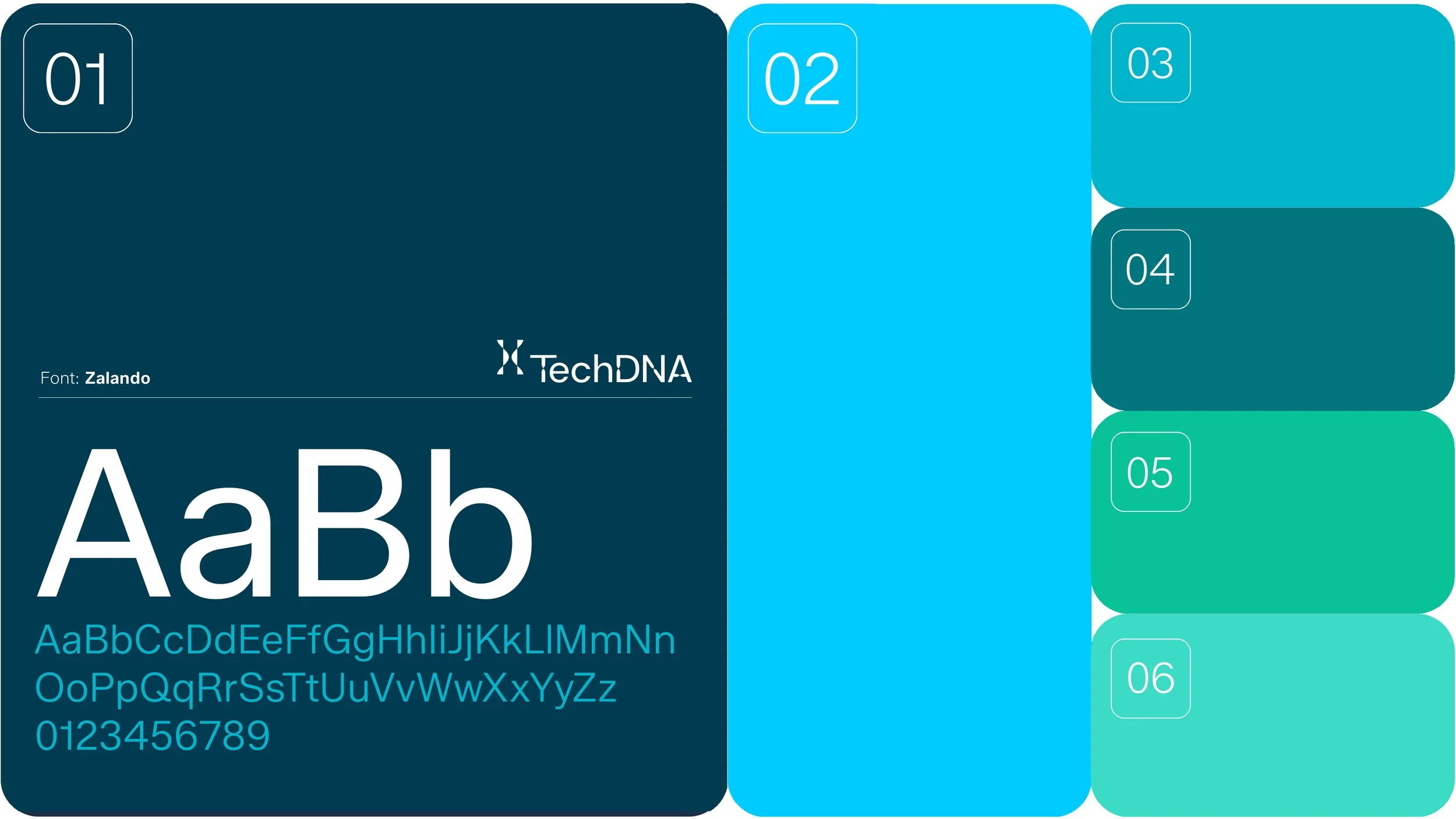
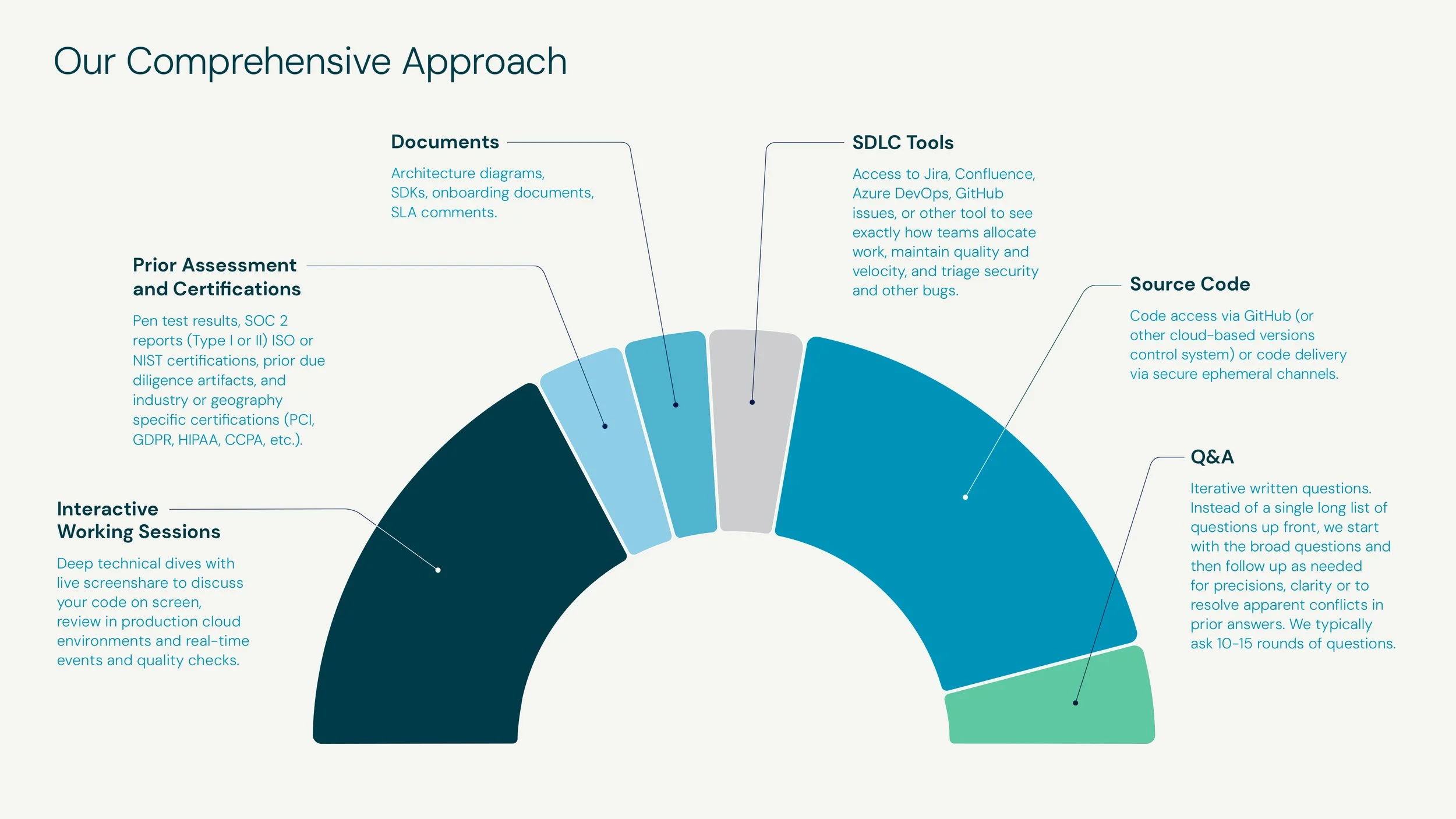
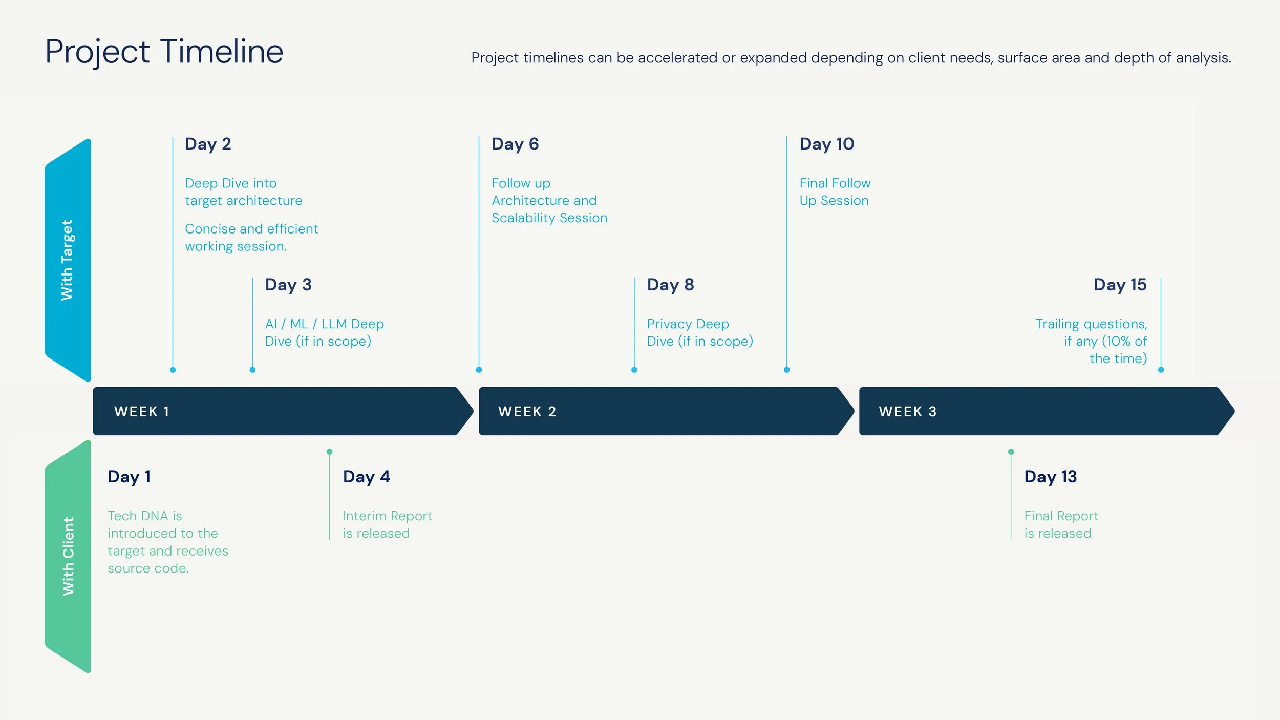
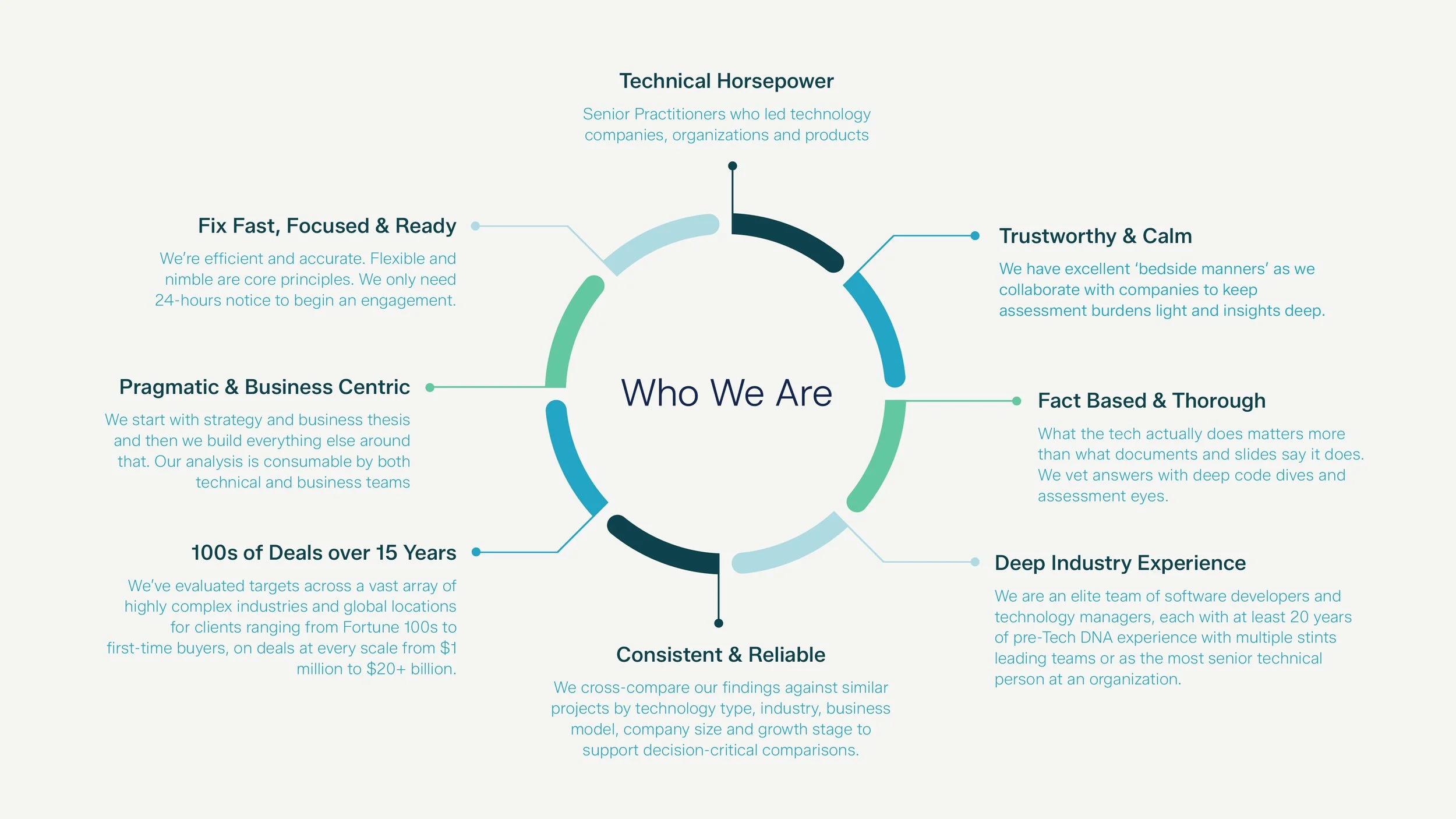
Founded in 2009, TechDNA is a global leader in technology due diligence and was looking to update their brand identity and modernize their visual language for a more contemporary aesthetic that aligned with the requirements and expectations of doing business in a digital-first world. They pride themselves on using straightforward language that cuts through the often overly technical terminology typically used across their industry. The objective: set the right visual tone for the company by unify their brand visuals and introducing a cohesive design system that better represents not only what they do and who they are, but is a truer expression of their values and beliefs.
An updated logo lies at the heart of their new visual design system, and an abstract symbol—inspired by a DNA strand—encompasses the ideas of fluid intelligence, dynamic thinking, and cognitive flexibility. It serves as both an independent graphic (paying tribute to the foundation of the company) as well as an accompanying design element helping to reinforce the name. The result is a brand identity that is tech forward and bold, exuding the professionalism found in the world of corporate acquisitions while embodying the precision required for effective and accurate software analysis.